
About Me
Hey there! I’m Mohammad, a driven analyst with a background in business and operations .With experience in tools like SQL, Tableau, Excel, and Power BI, I specialize in cleaning, analyzing, and visualizing data to uncover trends and optimize performance. My projects include building interactive dashboards, analyzing business metrics, and developing data-driven insights for real-world applications. I'm continuously expanding my technical skills and applying analytical thinking to solve complex problems.
Skills

Excel | Tableau | Power BI | SQL | Python
Featured Projects
SQL | Excel
Paris Olympics Dashboard
Analyzed the recent 2024 Olympics and refined the data to be seen in an excel dashboard for ease


Tableau
Worker Attrition Dashboard
Created a comprehensive Tableau dashboard allowing stakeholders to filter by department/role, examine attrition drivers, and identify where targeted retention efforts may be needed.

Power Bi
Heart Attack Risk Analysis Dashboard
Created a Power BI dashboard that analyzes heart attack risk factors by examining demographics, cholesterol levels, and high-risk conditions to identify trends, highlight at-risk patients, and support preventative healthcare strategies.
SQL | Excel
Paris Olympics Dashboard

- I chose to use the recent Paris Olympics 2024 as my primary resource and used websites such as Kaggle and Olympics.com for my datasets.- I then created a Dashboard for the data I will be storing via PowerPoint and extracted it as a jpg file to use in Excel later.- I then wrote down in a temporary Excel sheet the data and sections that I would be looking to add onto my dashboard for a visual representation of some key statistics from the recent Olympics.- After creating a plan and layout for what I was looking for. I went on to add some of the datasets to the excel sheets. I cleaned the data and removed unnecessary information from the tables that were provided.- After doing the first initial cleaning. I imported the new csv files into MySQL and coded all of the required data that I would be needing for my Excel formulas. This way I would know what I was looking for numerically in Excel and also documented all of the SQL code with screenshots of the results into a Word Document for Storage.- Once I had everything coded. I went back to Excel and started cleaning the Data a second time. This time I added columns to my tables and added information that I now would need to formulate my data to achieve the required output. Then I created pivot tables of the separate tables and created graphs and charts of the data that needed to be showcased.- Finally, I put all of the graphs, charts, and data onto the Dashboard sheet. I then adjusted the colors to make it visually appealing and added text to the sections for ease of use.
Tableau
Worker Attrition Dashboard
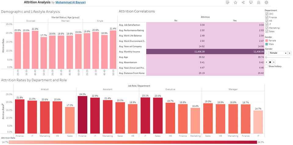
- Dataset Overview: Analyzed a 10,000-employee HR dataset containing 26 fields (e.g., Age, Gender, Job Role, Performance Rating, etc.).- Key Objective: Investigate factors contributing to employee turnover—focusing on department/role breakdowns, job-related metrics, and personal demographics.- Worksheet 1 (Departments & Roles): Compared attrition rates across departments and roles to pinpoint where turnover is highest.- Worksheet 2 (Correlations): Examined Job Satisfaction, Work-Life Balance, Performance Rating, and other job-related metrics to see if they differ significantly between employees who left vs. stayed.- Worksheet 3 (Demographics): Explored Age, Marital Status, and Gender to spot any lifestyle factors linked to increased attrition.- Visualization Techniques: Used bar charts, 100% stacked bars, and calculated fields (e.g., Attrition Rate) for clearer insights.- Findings: Minimal difference in averages for job-related metrics overall; certain departments/roles show higher turnover; demographic impacts (e.g., age groups) are less pronounced when viewed as percentages.